" height="41.855079948054374px" id="jtsq6Ll11" transform="translate(3.586 4.004)" width="141.65808959934216px"/></g></svg>)
Planning the work
My method of playing with crayons in the calendar
Sunday afternoon is usually the time when I open my laptop and check the following week’s schedule. I like to be prepared for the upcoming waterfall of meetings, requests and ad-hoc huddles. How do I do it? By playing with crayons in my calendar.

As I transitioned into the role of Head of Design, I found myself at a crossroads, reminiscent of Mark Akerman’s, Tandem CTO's wise words: ‘You either play with Lego bricks with other kids or are a meetings goer. But you cannot do both.’ Suddenly, my calendar became inundated with meetings, leaving little room for the hands-on design work I cherished.
“You either play with Lego bricks with other kids or are a meeting-goer. But you cannot do both.” — Mark Akerman, Tandem CTO
I still “played with Lego” at the time, though — I sat with my Designers, pushed pixels, discussed the ideas and planned the Design System. However, with Tetris blocks appearing all over my calendar, I struggled to get actual things done.
In my head, I was still a UX designer, drawing boxes, painting them with colour and shaping the experience for our users. That was my safe space, my box, the comfort zone. I thought I could do both, in opposition to what Mark said.
But in reality, I needed to transform into a movie director, an orchestrator, a composer, thinking about the bigger picture and delegating.
In search of a practical solution, I revamped my time management approach. The answer? A simple yet effective colour-coded calendar system. This method not only brought order to my schedule but also helped me strike a better balance between focused design work and essential collaborative sessions. In this article, I break down the easy-to-implement approach, hoping it resonates with those facing a similar tug-of-war in the demanding world of professional responsibilities.
My colour blocks
To keep my work-life balance in good health (or at least trying to) I split my tasks into 2 calendars:
Personal
Work
For both, I use the same methodology of colour blocks.
For personal stuff, I use Apple Calendar. For work — Outlook. In each, I have defined categories and applied colours to them. That allows me to quickly scan the schedule and recognise the type of events.
But I do not put work events in the personal calendar (unless it’s a hotel booking or conference I attend, so it’s easier to navigate to it) to keep the work-life balance in a kind of healthy shape.
Personal calendar
So, for personal, I have created the following categories:
Home (Green)
Mine (Blue)
Family (Pink)
Freelance (Yellow)
Arsenal (Red)
These five categories fulfil my needs so far. However, I am flexible to create new ones if there is a need.
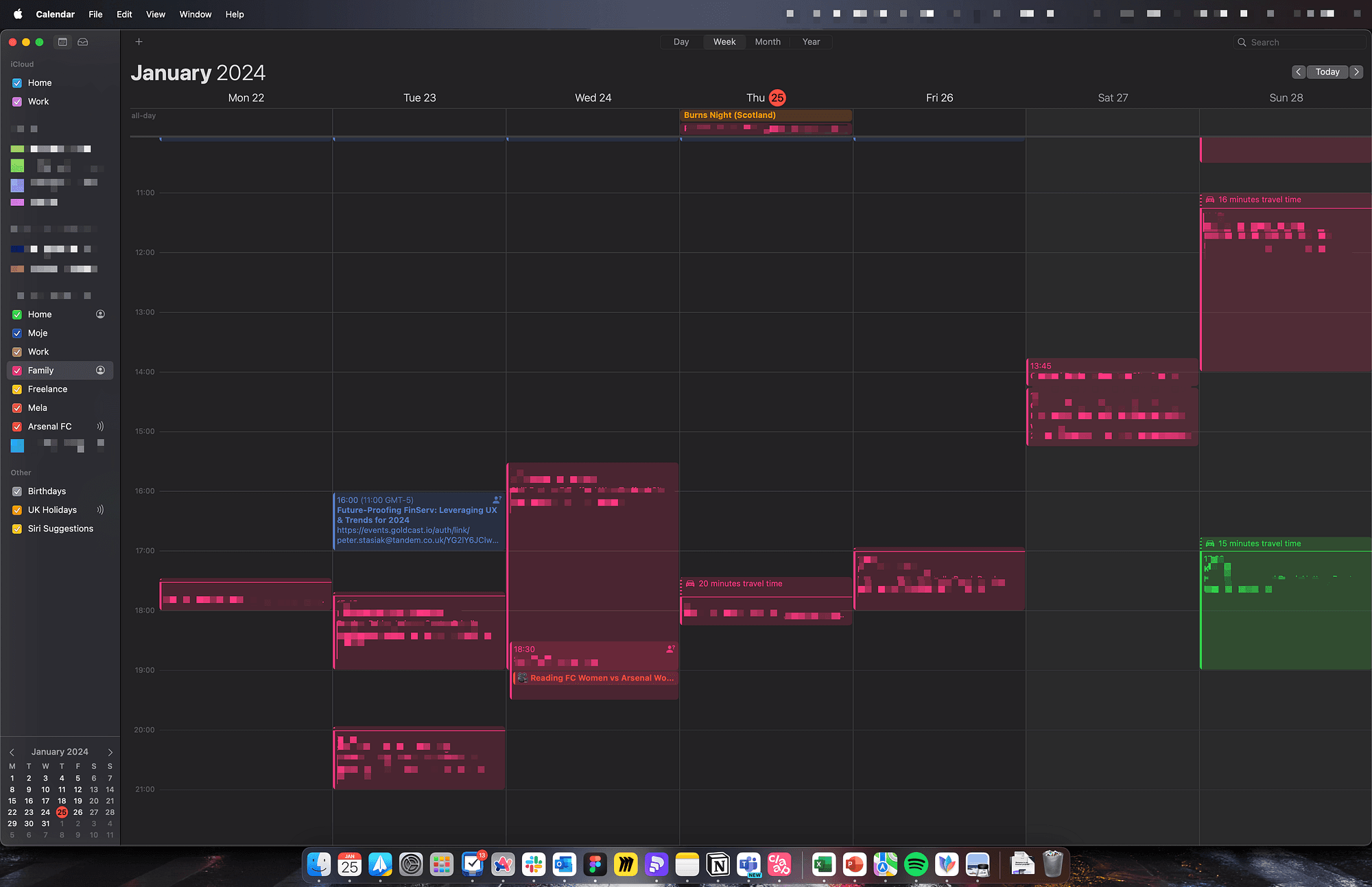
My personal calendar
Home (Green)
The home category applies to all regular events that are important for the household and rely on me and my wife’s actions, or it’s for us to remember. That could be the posting of the parcel, the friends’ visit, a date, or the Gas engineer boiler service (by the way, that reminds me to book them now!). I share this calendar with my wife.
Mine (Blue)
The Mine category applies to events which belong to me. These are things that I need to do: go to the gym, take my parents to the airport, travel somewhere, etc.
That is also the Morning Routine (Every day I wake up my kids at 7:15, make them breakfast and prepare for school). That could also be the Apple Event, car service, or a reminder about the webinar or training.
I consider adding small habits into that category (or creating a separate calendar for them) to follow the “Atomic Habits” concept — small steps, one at a time.
These do not get shared with my family as it’s not relevant to them.
Family (Pink)
The family category is a shared calendar with my wife and my kids. These are all events that apply to all of us, and it is the largest one. So we have here all school breaks and holidays, all football practice sessions and games, dance classes, swimming pool, family days out, trips, etc.
Every time I add a new event to the family calendar, my wife and kids are notified. My rule is “If it’s not in the family calendar, it doesn’t happen”.
On a side note, currently, all family events are planned on an ad-hoc basis. But recently, I saw a video of Vinh Giang on Instagram about family calendar planning. I liked his concept, and I want to introduce it in my house. He said that every month he goes with his wife to the coffee shop for a few hours and they plan the upcoming month or two. They put all events on the calendar so they know what will happen. I’m taking my wife for a calendar date later this week to plan February out.
Freelance (Yellow)
The freelance calendar is usually empty, as I do not do freelance work anymore. But I do book in any consultations, so it differentiates from other types of events.
Arsenal (Red)
And finally, the last type of personal calendar — Arsenal. I’m the gunner’s fan, and I subscribed to their schedule, syncing all Arsenal games straight into my calendar. I also do it with the FIFA calendar during the World Cup or the UEFA calendar with the Euro Cup.
The setup above I have used for years, so it was easy for me to apply it to my work calendar too.
Work calendar
So for work, I have the following categories (in alphabetical order):
Absence (Dark pink)
Design Team call (Orange)
External call (Purple)
Face 2 Face (Light green)
Focus time (Yellow)
General (Grey)
Important (Red)
Internal call (Coral)
Personal (Blue)
Recurring (Navy)
Working elsewhere (Dark green)
Sometimes I edit these to reflect the need or to adjust settings, but as for the whole 2023 and January 2024, this is my list.
I’m cautious of the colour setup, though. Outlook doesn’t offer amazing shades or a range of colours. Also, I use Outlook in dark mode, so these stand out slightly better.
So let’s dive into the categories.
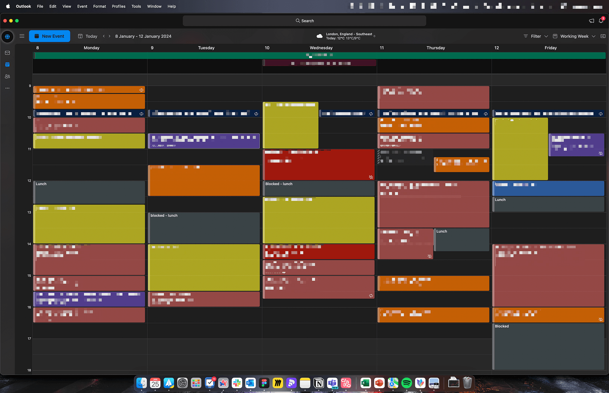
My work calendar
Absence (Dark pink)
The absence calendar seems logical — I mark it with this if anyone in my team is off. I try to avoid checking multiple sources to find out someone’s off and always require my team to put a simple calendar event named “Your name A/L”, which allows me to scan the diary and adjust the plan accordingly.
I also mark this way my holidays and invite others to the “event”, so all relevant people know that I’m off.
Design team (Orange)
Design team calls are orange as they are important to me, it’s my team, and I look after the guys. So all meetings and calls for design reviews, 1:1s, Monday kick-off and Friday summaries are orange. More on these types of meetings in this article.
External (Purple)
External-type calls are all with people from outside of our organisation. That could be partners, 3rd parties, contractors, or tool providers. Often, if the call is arranged by an external organisation, Outlook automatically tag them with the label [External], but I like to visually separate them from other types anyway.
So, for example, we have some moderated user testing call this week, and it’s purple. The same call with Webflow or Claap people would be purple too.
Face to Face (Light green)
Face-to-face is not that common, so there is not much green in my calendar. However, every time I go to the office and meet someone in person, the meeting is marked as light green. That highlights to me that we are not on the call. Otherwise, it would be coral.
Focus (Yellow)
Focus time, it’s something I began doing more often recently (I will explain that deeper later). I chose a yellow colour, as it reminds me of yellow in the personal calendar (freelance) — meaning my work, something I have to focus on.
General (Grey)
General is a blocker that is less important, hence grey. It’s usually my lunchtime or any meetings I sent out, but people have not responded yet. When they do, then I change into a particular colour.
Important (Red)
On the opposite spectrum, I have red-important calls. These are crucial, must-attend types of meetings. It could be a call with the CEO, CTO, or something urgent. Red means awareness — no-brainer here.
Internal (Coral)
The most common colour is coral — internal calls. I mark every usual call with this colour. That could be a meeting on the ongoing project, a new project, a random request, check-in. And to be honest with you, it worked, but recently I began wondering if I should expand on this slightly. I have a few ideas on what to do, but I haven’t decided yet.
For example, some of the concepts I have are about separating new project kickoffs from ongoing projects. Another idea was to colour-code every project with its own shade (but I worry I would run out of shades). Not sure yet.
If you have any ideas on this subject, or if you use some kind of methodology, comment here and share with me, please. Maybe your setup would work nicely for me, too.
Personal (Blue)
I mark in blue every personal event. It’s more of a blocker than the planned event, as usually, it corresponds with the event in my personal calendar. So, for example, if I have a personal event during working hours (i.e. doctor’s appointment), I would mark it as blue in my work calendar and blue in my personal one too.
Recurring (Navy)
Recurring events are 1:1s with my manager or standups for particular squads, which I don’t have to attend, but I keep them in the cal if needed.
Work elsewhere (Dark green)
And finally, dark green, working elsewhere. Every time I go to the office, I mark it in my calendar and highlight which office. I often share that event with others to let them know where I’m going to be that day, so they can plan accordingly and meet me in the office. There is no point in going to the office to sit on your own on Zoom calls all day.
Colouring
So now you know my crayons, I can tell you how I approach colouring my calendar.
Every Sunday afternoon/evening, I open the calendar and go through already planned meetings to see what’s happening.
I open my to-do list (Things or recently Notion) and check what task on the list is urgent to deal with. Then methodically, I book meetings with relevant people and mark them with appropriate categories/colours, or I block my schedule to focus.
Focus time
I began blocking times last year. Before that, very often I fell into the trap of back-to-back meetings, which didn’t allow me to do any actual work. There was lots of talking, but not much action. Yellow blocks for Focus time give me that space.
Until recently, I was blocking my calendar, putting just “blocked” into the title. But quickly I realised that confused me, as I needed to refer to my Things list, and often I wasn’t sure what I was supposed to do.
A few months ago, I changed that into “Focus — the task name”. I plan my to-do list focusing on what’s the most important, and what’s the most time-consuming. I plan the time I need to focus on it and block the calendar accordingly.
That doesn’t mean, unfortunately, I will spend all that time focused on working on the task. The blocked calendar is not very user-friendly, if you will. Others who need to meet me will not be able to put anything in.
That could be fine, but often these are project meetings requiring more than just two people and finding the right spot fitting for all may be a hell of a challenge. Then I can analyse and adjust my plan accordingly. If the meeting is important and I need to be at it, I will move my yellow blocks around. If the meeting is one of those less burnings I can refuse to accept and suggest another date/time that suits me better.
Thanks to that approach, I’m less inclined to be waterfalled with tonnes of meetings from morning to evening without chances to do anything. I’m not playing with Lego anymore, but I still need some time to plan the strategy, build the deck or write the proposal. So crayons come in handy when playing with my calendar.
Conclusion
Since implementing this colour-coded system, the benefits have been brilliant. The visual clarity it provides has allowed me to quickly navigate my calendar, instantly identifying the type of each meeting. This not only streamlines my scheduling process but also enables a balanced approach to doing the work and attending meetings.
The system has significantly improved my work-life balance, ensuring that crucial family events and personal commitments are integrated into my schedule. The colour-coded categories serve as a guide, allowing me and my family to run events easily
I’m curious to hear about your calendar management strategies. Feel free to share your methods or tips in the comments below. How do you tackle the balance between work and personal commitments? Do you use “crayons” colour coding or have other effective systems in place?
Your insights could be super helpful, so let’s start a conversation! Share your thoughts and strategies, and let’s collectively explore new ways to conquer the calendar chaos together.
—
This article was originally published on Medium on 25 January 2024